can I help you make it? ![]() I’m doing things in HTML and CSS…
I’m doing things in HTML and CSS…
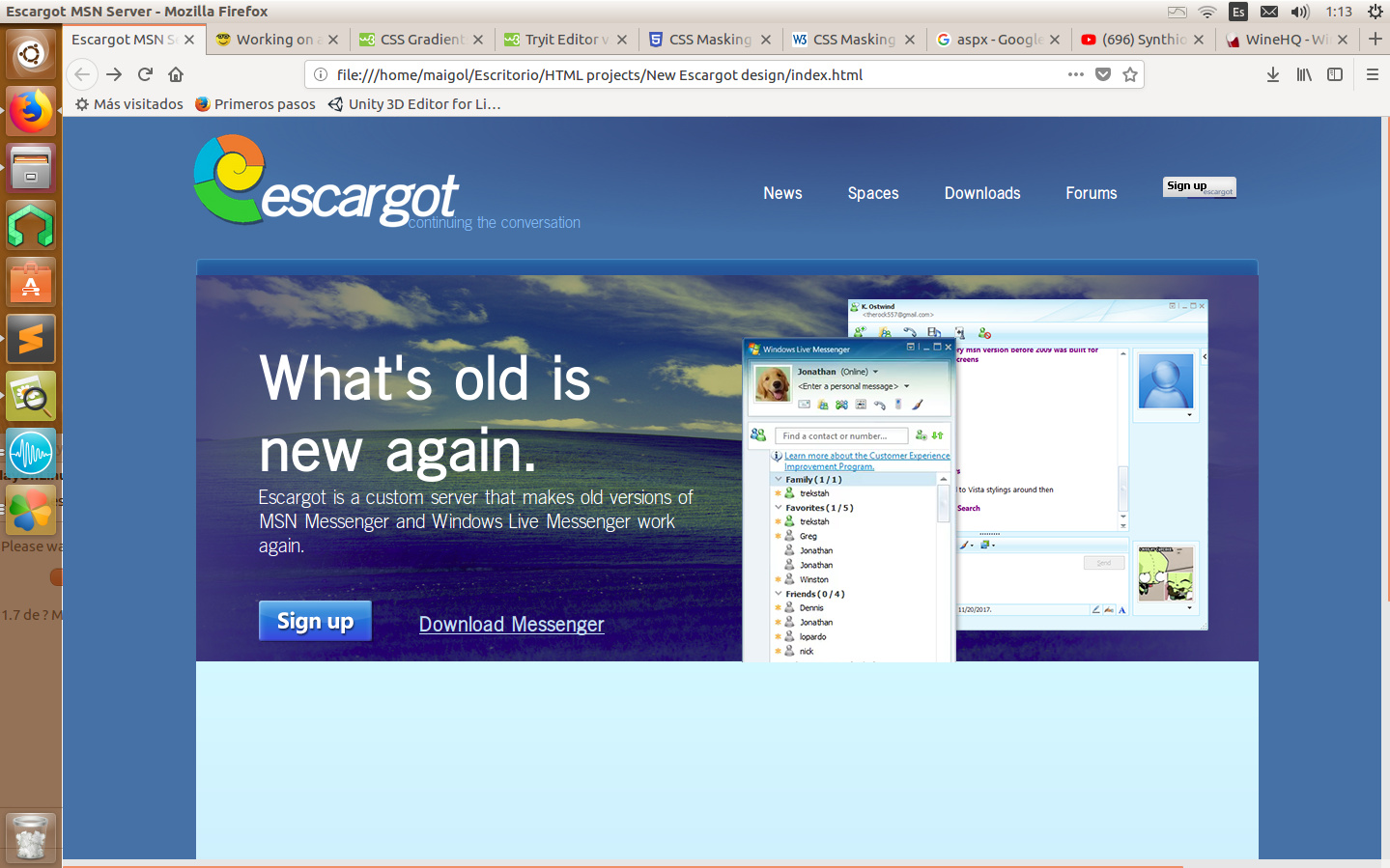
this is a screenshot of what I can do until now:
and yes, it’s Spriteclad’s design made into html… It’s a work in progress
can I help you make it? ![]() I’m doing things in HTML and CSS…
I’m doing things in HTML and CSS…
this is a screenshot of what I can do until now:
this is amazing 
Yes you can !
I had a new idea, make a Escargot Hotmail thing with the pictures I have…
Amazing! It will look perfect when finished.
I can send it to valtron when it’s finished? 
LOL that’s usually my job with that kind of stuff. 
Yessssssssss this is the best 10 of 10
If I’m going to be honest, this looks as good as @Spriteclad’s Photoshop design.
However, regarding your project, the “What’s old is new again” panel’s gradient is kind of dull and off compared to the original design. And I also notice that the main font looks like MSP-something (hope that isn’t the default font for Ubuntu, or else we’d have a Times New Roman rendition of the site on Windows machines ![]() )
)
To address @Spriteclad and his original design, I’d be against image grabbing from @TReKiE’s video showcasing the MSN Messenger versions and whatever appears on Google Images, then using that in the final product. Someone knowing what their doing could get the Escargot dev server up and running, create somewhat realistic-looking dummy accounts, log in on MSN with those dummy accounts, then screen grab the windows and use those instead. Seems a bit more professional, don’t you think? ![]()
The Windows Live design circa 2006 (Wave 1 or 2, used in the WLM 8.5 UI) would fit perfectly here, and I don’t think that Escargot logo was good, anyway, even when it was first conceived, so maybe the current butterfly logo would make a good fit for the logo area.
Those are my two cents on what you have right now. ![]()
Are you talking to me or Compuser?
You.
Wut
This is a huge contradiction xD
Don’t worry, I’m testing the page in different OSs browsers and resolution. The font isn’t the default; it’s TraditionSans.
And with the “what’s old is new again” font, I’m working on changing it, but seems like CSS doesn’t like to cooperate with me…
The images are exactly the same as the original design, I ripped them from there. I could change them at any time, so don’t worry about that.
The wat?
To address the first thing, yeah that didn’t come out as I had expected. It looks good, but the “What’s old is new again” panel’s gradient is kind of dull compared to the original design, is what I meant. ![]()
Now, the third thing you address from my reply was meant to be directed to @Spriteclad, but I couldn’t find a place in that paragraph to address him in that light.
To address the last thing you bring up, refer to the WLM 8.5 UI. ![]()
Yeah there were things that I just couldn’t rip from the original image, so I ‘remade’ them in gimp, like the bliss image, or the top circle gradient…
Thanks for the feedback anyways
Just keep on tinkering with the gradient settings and you’ll probably get something close to @Spriteclad’s design. ![]()
(Although I’ve never used GIMP for gradients, so IDK if they’re limited in nature or if they’re Photoshop quality)
Beautiful, it reminds me of Windows 95 setup.
I can help for you if you want . I’m pro at html + css
I would really apreciate the help, but
Thank you anyway
Okay no problem ![]()
Good luck