Put the ‘e’ also please
1 Like
This is just cluttered looking.
It’s one graphic icon too many.
And again I object to using the butterfly for several reasons, not the least of which is the fact that it’s a registered trade mark and I don’t think you want to attract that kind of attention.
3 Likes
I like this logo.as for the msn butterfly i agree with you. But valtrom likes the butterfly. Soon i will send you my ‘people have the power’ slogan.thank you
1 Like
if I’m going to be honest, I think an emphasis on using the original MSN butterfly would be both potentially dangerous (no doubt Microsoft would not like to see that or there might be the claim that escargot is trying to pass itself off as msn) and rather, hmm, backward looking?
Although we’re trying to revive an old system, I’d say we should also look forwards, because escargot as we know it might ultimately grow into something more.
At any rate here’s another play on things;
Though I feel the use of RGBY has a better tie to the old times sake without being blatant…
edit: two more of this ver but with the other type faces
4 Likes
Nice. Can you do it again using the font from jowie original logo?
1 Like
https://wink.messengergeek.com/uploads/default/original/1X/78892812269b44fd71ff519d5de0efa57947bd94.png
you mean like that one?
3 Likes
Thanks Yuka for your efforts, sad not to see any of them being used. 
3 Likes
Handwritten “people have the power!”.

And in a style more similar to the requested original

Not really sure about this slogan though for some reason
One more … tetrashell? …tetrapods are a different thing altogether…

I think I personally like this one the most.
2 Likes
thanks for the handwriting. i did not have a scanner thoght the slogan is my purpose.of caurse if you have another you kindly type it. thanks anyway! 
1 Like
Good stuff. Of all of them these two are my favorites:


I’m using the second one as the icon for my Wine-bottled MSN Messenger 7.5:
I also really like the font used. What is it?
3 Likes
Hi guys,
I have slightly edited one of yuka’s ideas. In my opinion I think I would like these ones. Let me know what you guys think.

4 Likes
Ey, just wondering if any1 can make an “Escargot: Games & Activities” logo plz
I really like both of these! If one of these can be featured on the site sometime that would be PERFECT!
3 Likes
Yes I thought they were kinda catchy too, even though I edited it very subtle, thanks to yuka who made it himself
2 Likes
These are all really nice! I think my favorites are Jowie’s edits of yuka’s logos.
Some of them look like they’d be good logos for a Linux distro somehow.
2 Likes
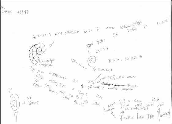
stuff i made on paper
1 Like
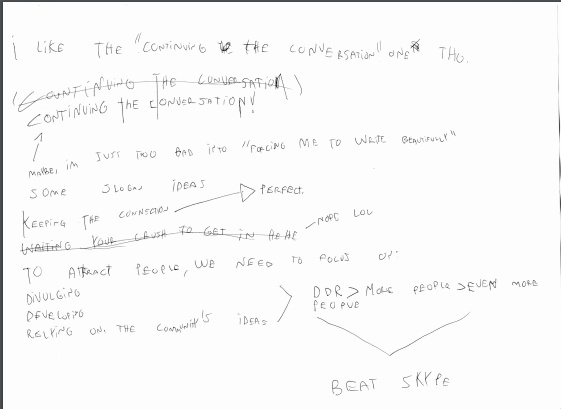
here i added some slogan ideas, only one: “keeping the connection”
and some other stuff
2 Likes
I’m going to keep that simple, because I think simplicity is modern.

@Nintel you’re looking for Blue Highway.
@tomatohentai the positioning of the … tetraconch?.. can be toyed with, which is what @JoSch did, it does produce a different effect
@Megadeth58 I suppose a 3D-esque shell would be more like classic MSN’s butterfly but a flat one is more … current? Keeping the Connection seems to work though it doesn’t alliterate as nicely. Chuckle.
2 Likes