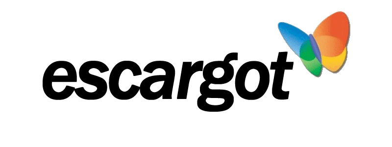
I just made it. You can get it here:
(Right click and save as)
I like it! Though, it may make sense to hide a snail in there :3
Thank you @anon90706025!
Yes well I talked to @valtron the other day and said it was perhaps not such a ide to use the snail…
(:
Awesome @Mateus_Rick! Here you have it in blue-ish:
Really works well for adding services at the end…
(accidentally put it in wrong thread, whoops. now its in the right one ![]() )
)
Nicely done @MichaelPower! 
That is very nice. ![]() it’s a good idea to use these.
it’s a good idea to use these.
I would highly suggest to avoid using the MSN butterfly because it’s a trademarked logo. (Sometime you can see it with a small circled r next to it). Better not to attract the Microsoft lawyers… Maybe someone can make a snaill with the same design as the butterfly?
Or, you can find another (unused) butterfly logo…just googling for “butterfly logo” led to many ideas.
Oh hey Jowie, I remember seeing you on Neocities! Nice logo. (Though you might want to make it more original?)
@JoSch Yes that is what I thought and suggested too, but valron thought it would not be looking good and people said it would not be a problem as we are not making money from it. So I only followed what they suggested.
Then you might change the logo’s and such on the messenger as well
@Spriteclad Hi there
I’m not against using a snail, I just meant that snails kinda look gross close up. Can someone maybe trace out a higher-res version of the (sn) emoticon? It wouldn’t look too bad as a cartoon, I think.
How about something a bit more abstract then?

Fancy. Was that made from scratch? If so, that’s really nice! (Also, what font is that?)
Nice logo 
Nice logo! Not sure about the font though.
Yes, and Amplitude.
Here’s a few other notions.


Awesome. I like the third one.
the third one look better since the logo at the front of the text looks more like an e.
Maybe it would be nice if the red part will be in the same size/style as the other coloured parts.

