Here’s my idea of a different branding approach from the butterfly…
5 Likes
thats cool doe
fill
1 Like
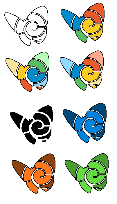
What about combining both the butterfly and the shell?
’
And how about some color variations?
And here’s one with a gradient that resembles the old MSN logo.

9 Likes
now that’s what i like to see.
Oh, that’s why you was replying to me, i did not understand until i saw you replyed to my request.
thank you.
Anyway, pretty good.
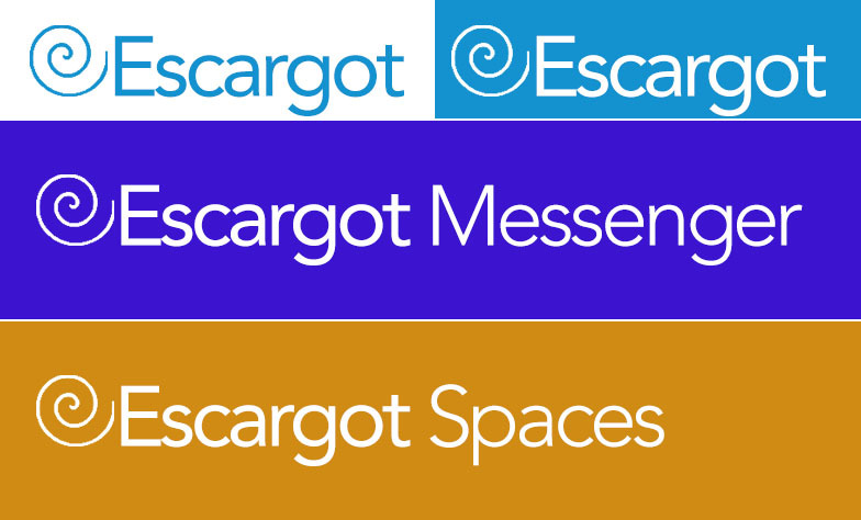
Here’s some ideas with the Escargot Shell logo that has been developed. (Credit to @JoSch for the current logo)


9 Likes
It’s a buttered snail

2 Likes
I like the logo Michael Made ![]() that is cool
that is cool
i didn’t know you go on escargot poke!
not a big fan of using it with Franklin Gothic still, as with what’s being used now, plus I’m still kinda wondering why the colors got changed around.
Nice one! ![]()
Dude at least give me credit for making it.
3 Likes
Long time @Old_Bill !
I’m sorry Pikachu1967, You necro’d this post.
ups i’m sorry 
like five people necroed this post, it’s fine man
1 Like
Because I saw the original reply via notification…
Yes, my one looks like the one that escargot is using because… I was the one who originally made it and -they- used it, changed the colors for some reason and used a different font.
…Yes, I’ve in essence given my approval for it to be used by making it and contributing it here, but it would have been nice if I had been credited on the page in some way.
This needs some anti-aliasing
The suggestions are nice but most of them have the style of the 80s-90s.