yeah but we even said “can’t we actually develop Escargot further so we can actually allocate some space for something like this?”
I mean, that does make sense. Get the important stuff out of the way, then focus on the additions.
But why the need to lock or hide a thread that’s simply suggesting an addition that @valtron can consider?
You know what Spongebob would say once he sees the vase filled with water while he’s extremely dry! “I NEEEEEEEEEEEEEED IT!!!”
Hah. I’m pretty sure you can survive with the flat site design for a while. 
1 Like
Oh well ![]() but if the layout changes to that, I’d be excited. Hell, even everyone would join in the MSN Messenger/2008 experience (via: the lol!! XD rofl w00t haxor and emo era of the Internet. That was the internet era I loved, so far wth the old YouTube n such). We got Escargot MSN, AIM Phoenix, VidLii, and FriendProject. What else? Escargot MSN gets a messaging service like Windows Live Mail/MSN Hotmail? (Shown in the image) if so, that’ll be fucking awesome!
but if the layout changes to that, I’d be excited. Hell, even everyone would join in the MSN Messenger/2008 experience (via: the lol!! XD rofl w00t haxor and emo era of the Internet. That was the internet era I loved, so far wth the old YouTube n such). We got Escargot MSN, AIM Phoenix, VidLii, and FriendProject. What else? Escargot MSN gets a messaging service like Windows Live Mail/MSN Hotmail? (Shown in the image) if so, that’ll be fucking awesome!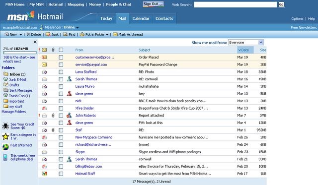
3 Likes
That’ll be an interesting concept to get up and running. And I notice in the image that people in your Messenger contact list have their status shown in their corresponding email listing, along with the option to set your own Messenger status. Pretty neat, actually. ![]()
I wish this interface would be added.
It needs to happen ![]() I wanna go back to the Hotmail times. Hope it happens so when I get a email on my Escargot hotmail, it’ll make a notification to my Escargot MSN!
I wanna go back to the Hotmail times. Hope it happens so when I get a email on my Escargot hotmail, it’ll make a notification to my Escargot MSN!
and OpenVK
open- what now?
VK. ![]()
Basically the Russian version of Facebook. ![]()
As nice as that is, I noticed an inaccuracy (by my standards, but yours may be different):
- The “.NET Passport” button was a “Sign In” button, then the user would have been able to sign up or sign in after clicking it. You probably already know the button was silver when not logged in, and blue when logged in. I’m guessing you have it as a “Sign Up” button in order to draw attention to it.
- Again, in my opinion, I would’ve changed the background in the lead image to a Windows Vista background, or the foreground to a screenshot of Messenger 7.5.
In my opinion, I personally would probably have modelled the website after the MSN Messenger public website of the time ((messenger dot msn dot com) in the Windows 2000 and XP era, (get dot live dot com slash messenger) in the Vista era, and you should be able to figure out the rest, assuming you’re using the Wayback if you wanted to look at those)
1 Like
realmente me gusta el concepto del nuevo diseño de escargot
this post is VERY old
Amazing work man and you can make it into HTML using photoshop, DM and we can do this together!
nice
Que tal esse elemento nos botões? 

q ?
this design is still very good but why tf they removed it
1 Like
animadoria says its bcoz its not responsive and a pain in the ass to update and maintain, and i can tell why