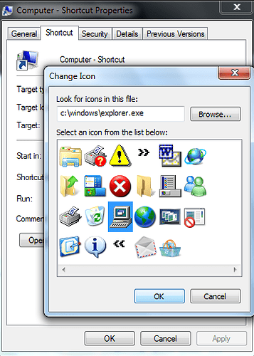
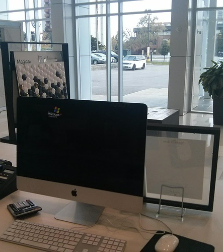
so i was exploring explorer.exe
verdict: ms is lazy
I don’t think it is lazyness, the resource might be used on older applications, by removing it it could disrupt the compatibility, i mean on every 32 bit version of windows NT based O.S NTVDM is present so even on windows 10 you could run some windows 3.11 applications.
even if…
it doesn’t mean actually, just put an new icon and make it 16 colors, simple as that
@gabipanda is completely on point. The first rule for Windows is that compatibility must not be broken unless there is a justifiable reason and product management can justify the “cost”. Arguably Windows 10 gets more adventurous with deprecating/removing than in the past, but with an icon resource, the cost of changing (or removing) is high and the benefits are practically nil.
The reason for the rule is simple, Windows is made for enterprise (business) first, they expect their software to continue working exactly the same as it always has and they pay the big money to have first tier support. So if one of their enterprise applications don’t operate or look right anymore because an icon changed they’re using, that company is going to calling up Microsoft and they are contractually bound to create a solution for them. It’s far easier just to avoid that by leaving it alone.
And that’s why few design changes beyond the basic look and feel haven’t changed since Vista. Sure Start has been mucked around (the less said about Win8’s Start the better), but the Desktop hasn’t changed drastically, nor File property dialogs, nor security/ACL properties, MDI window themes, most Control Panels, Device Manager, all other MMC snap-ins, etc.
Instead, they simply build new resources and dialogs (ie. Win10’s Settings) and leave the old in place (where needed).
So windows 10 is build of windows 8.Windows out of 7.7 out of vista and vista out of server 2003.
More or less.
if that would be true for themes that would be awesome
one of the biggest downsites for Windows 10 for me is the lack of Windows 7 AERO theme
maybe I want the clock or the microphone to look like a microfone or clock not just 2 numbers for time or a few holes for microfone
That is why I loved IOS before 7 (and Mac OS X before 10.10) came because of that, now it just look terrible in my opinion
businesses can always use classic theme if they are afraid of there employes not working because they would be too fascinated about theme look


