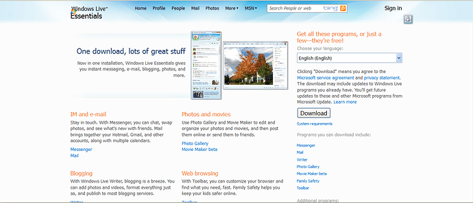
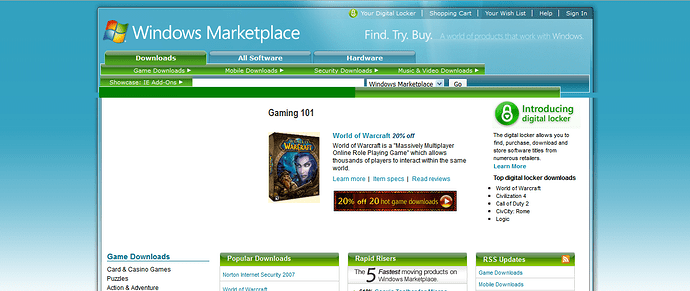
Hi, so recently, I’ve noticed how garbage few things look in current Escargot website design, especially the logo. It’s rubbish, it doesn’t really fit the Microsoft’s skeuomorphism, and it’s overall garbage. I have few concepts/ideas for the new logo, and how the website would be improved, while keeping that nostalgic look, but I might do it tomorrow. Right now, feel free to type about my opinion, and the website itself.
~lh11
Because it was remade from @Spriteclad’s photoshop to HTML by @Maigol.Anyways,the site is still under construction. @OhHelloThereImTheGuy will explain more.
I’ve felt that the current site design is a little underdone and has that “cobbled-up” look (as in everything looks templated) for a while now. It tries to look skeuomorphic, while it also uses a bit too many gradients for my taste. It also looks a bit plain in certain areas of the site, which has bugged me for a while. While I’m not thinking of a Microsoft-inspired design as an absolute solution, something that looks more appealing and less gradient-y (not to the point of it being Metro-esque, but enough gradients to give it pizazz without making it look ugly at the same time) would be better than the design that’s on the site at present. I’ve been working on one myself, and I plan to get back to working on it once I reinstall Photoshop.
Yeah, MS didn’t used hella lot of gradients IIRC, just simple glass reflection did it’s job.
IMO escargot site would look better with the MS 2007-2009 era site design
I had issues trying to find the patch instructions, i discovered that i had to go to the download page and click the “how to patch”.
Esacargot’s older design was simpler
The Bliss BG also looks really blurry and stretched.
Yeah,it looks like someone took a HQ version of 800x600 bliss and streched
About the Windows Marketplace - i tried to modify to make it as a “new” website for one of my projects, it’ll show that bar with half of it with it’s bitmap while the other half is the green box (as the screenshot shows). There’s bigger hope onto WLE website, since there’re not big bugs, or almost none at all.
what do you mean when the site looked all blue & glass effect
the blue site was brilliant
we definitely need some Aero designers. lul, ripping the textures from the windows 7 aero theme might be a good start lol
in aero we have all of winvista theme thingies ripprf, also they’re pinned somewhere
The OS Mockup/Graphic Kit also has lots of Aero resources and such that could be useful.

