An odd topic to make, ik. Just wanted to share my opinion. If you disagree or anything. Feel free to do so peacefully.
I wanted to make this to say why I don’t like modern webpages.
I’m not a fan of what website builders such as squarespace and wordpress give you.
Today, no webpages have their own style. Sure, they may use different colours, or a slightly different layout, but they’re basically all the same. Boring, if even. Back in the early days of the internet. Websites were like Skittles. No two skittles are the same, no two websites were the same.
In my opinion, these websites are in a way so simplistic in their design, that they hinder creativity. That’s what modern websites fail to give you- that “charm”, that feeling you get when you see your work, that feeling that tells you, that you made that. Yes, I do understand that website builders are great for those who just want to get a presence on the information superhighway, but are intimidated by markup languages such as HTML. To be honest, that’s completely ok!
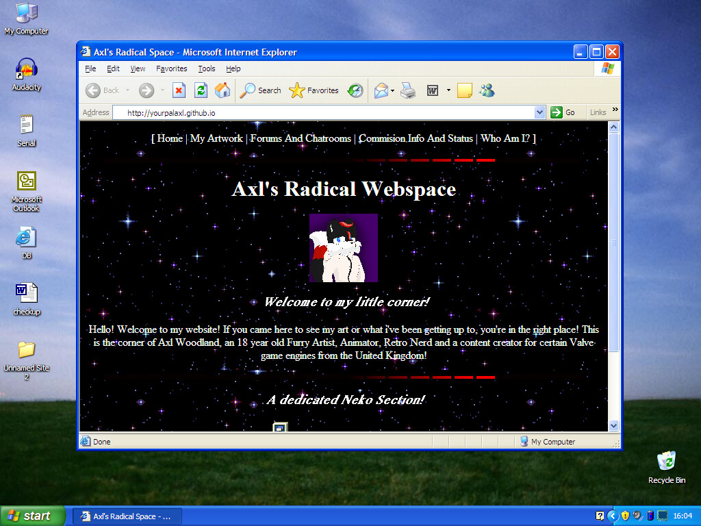
Even basic HTML like this I love, because despite how basic it may look. It still greatly shows the user’s creativity. It’s got that charm to it. It’s not boring. It’s more fun and inviting than modern webpages. The user isn’t bound by modern sans serif typefaces, shifting banners and minimalist graphics. This is the user’s space, their canvas. They can build their space as they see fit, with little to no limits. With a modern webpage, you never actually built it from scratch. The feeling that you actually worked to create your space is greatly diminished, or is just not there at all. Non-modern webpages make you more free, you’re not bound by modernity. That feeling you get when that one gif doesn’t position where you want is just not there anymore with modern webpages. I am however a little more ok with business sites being modern, having a professional look as a company these days is a good start. That’s why if you look at my website, it looks dated. I wanted it to look that way. I wanted it to have that charm. I wanted it to look fun and inviting for visitors.
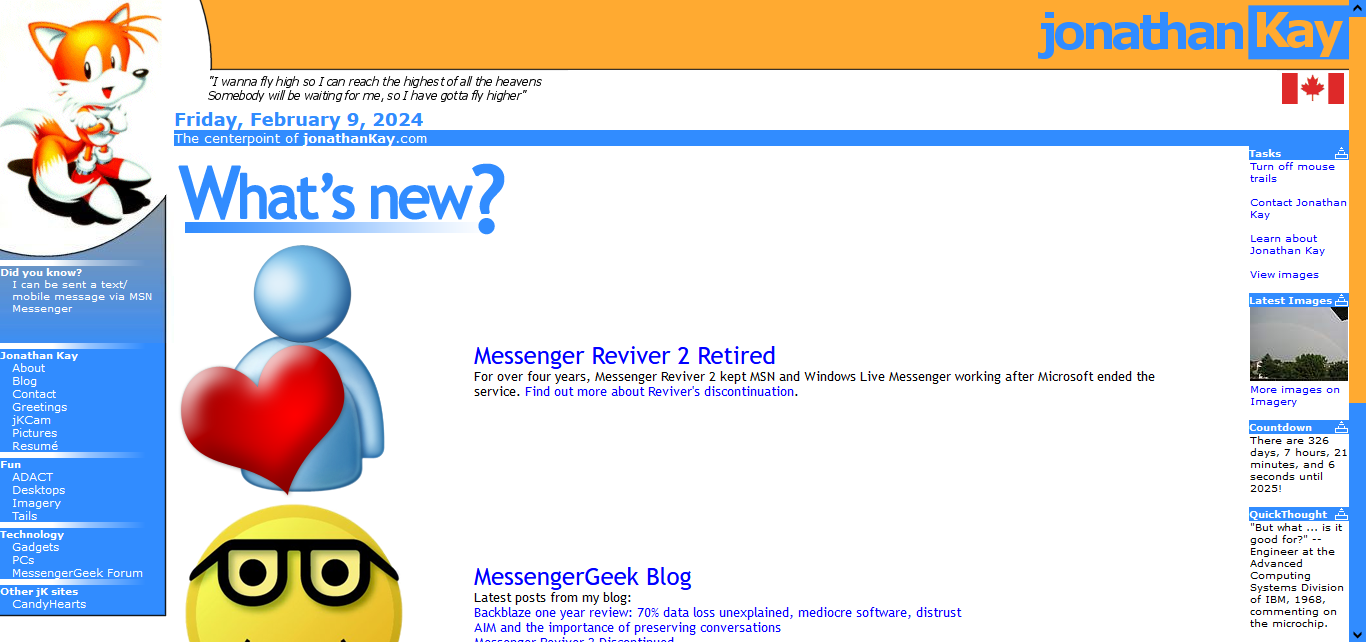
This is TReKiE’s website. It’s barely had an update in years, yet it’s still completely OK. It never lost the charm. It still is inviting.
Sorry for the little rant here, I was incredibly bored lol.