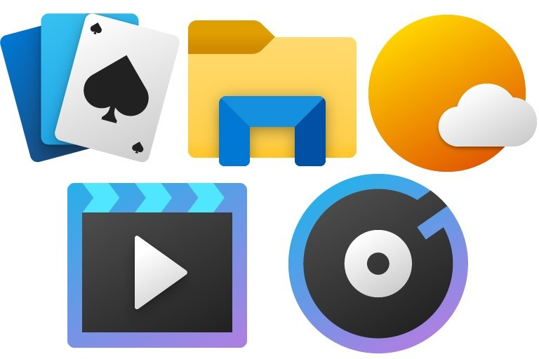
Thoughts?
Not bad. I like these
it could use some more details in it but omg the GRADIENTS
gradients make flat design much better
hey my favorite is solitaire and groove music icon
They’re alright. At least they’re an improvement over the old ones, which I found to be a bit dull.
new icons were leaked ever since insider builds for 1903 were coming out. but those eventually only came to office and skype.
I think them look extremely nice, a great improvement over the old icons
Flat is flat, I think some shadows to make them more realistic would be good enough ![]()
a step in the right direction from COMPLETE minimalism
Please come full circle 
a little of colors would be good too
I don’t like them, I miss Aero!!!
Why do people just hate Windows 10 just because there’s no Aero (even though there’s like, Aero-y-ish shit in some UWP apps like Settings and Calculator)?
I don’t hate W10, I kinda like it, but I miss Aero. I’m just not very fond of Metro design language.
Windows 10 does not even use Metro (other than the start menu buttons), It uses another design language.
Whatever they call it, I don’t really like it.
^^
Windows 10’s interface is not metro at all, just compare it with Windows 8.1 and you will see
All I was saying was that I wasn’t fond of W10’s UI.
Not very found of flat icons and themes
Well, it’s a mix between the old 2015 windows 10 icons and the aero icons.
